MyVM App
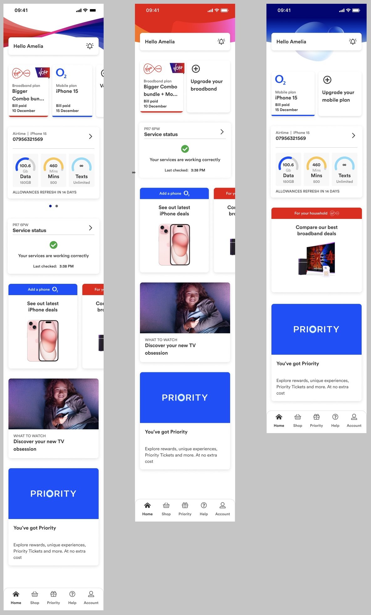
Context: The goal was to bring Virgin Media and O2 into one app so users could check their bills, find and fix any service or account issues, check their data usage, explore offers on products, and access Priority.
My work: I wrote clean, accessible, and minimalist copy, balancing the two brands’ tone of voice to create one holistic experience – turning the dial between moments of delight and purely functional copy depending on the message. The biggest challenge was managing so many sections of both brands in one app, in an intuitive experience.
Outcome: In seven months we created a working prototype from scratch.
My approach
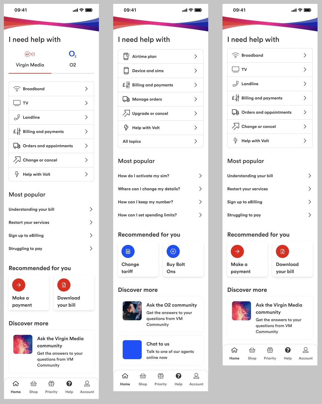

For app copy, space is limited. So the fun challenge is ensuring all the information the user needs is easy to navigate. Help and support sections should offer instant clarity, helping the user find a solution to their problem.
When a user has a slow broadband connection, we have up to five loading screens and one error message to show them.
Error messages and loading pages are where brands can amplify their tone. They should inform and alleviate any frustration. For general errors I injected humour with a solution without exacerbating the problem.
Minimalist
Loading messages
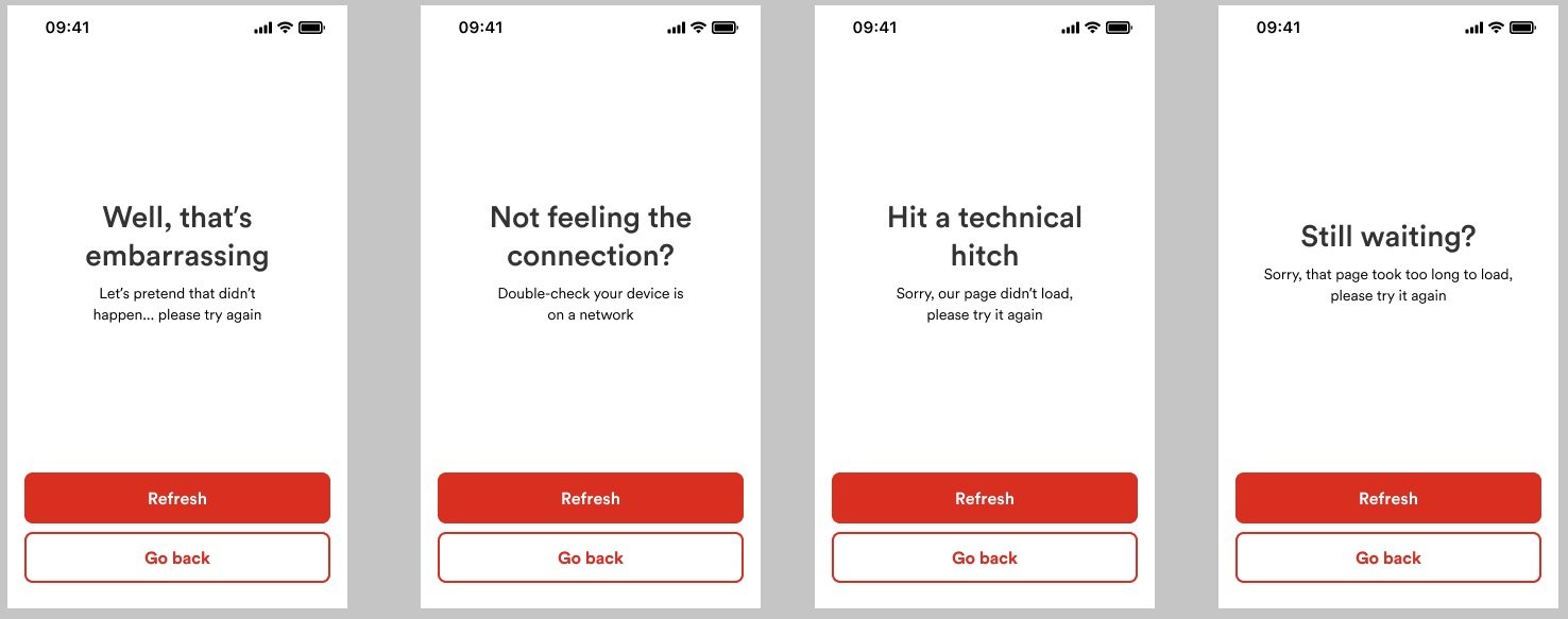

Error messages
I took inspiration from video games to give users hints and tips to get more value out of our service.